Skip to content
noel.marketing
Framer ComponentAvailable now

Cartique

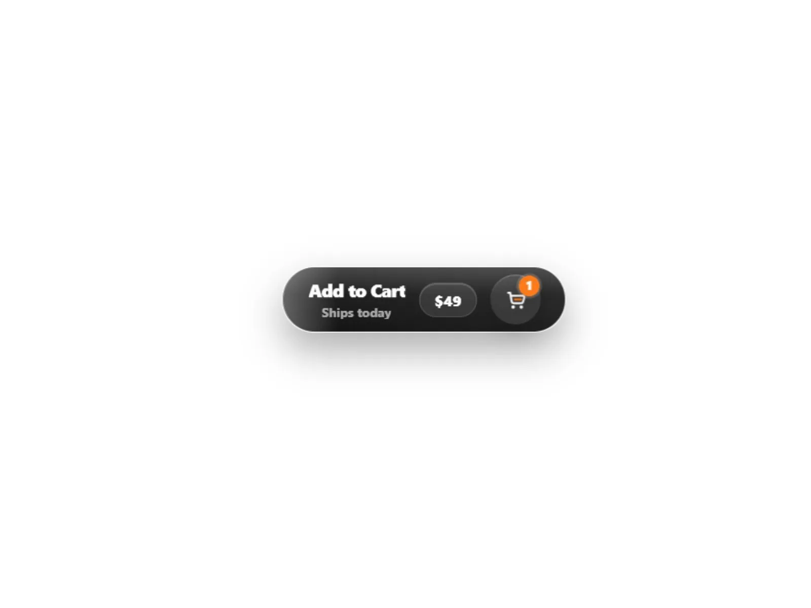
Cartique Framer Component — Premium animated shopping CTA.

Premium animated shopping CTA — a Framer component you configure entirely from property controls.

€5.00

Cartique preview
Product preview
View demo

Secure checkout via Lemon Squeezy

VisaMastercardPayPalApple PayGoogle Pay

Available payment methods may vary by device and region.

Cartique

€5.00

Demo

Live preview

Preview the component in-browser

Explore the real hosted demo directly on the product page, or open it in a dedicated tab.

Open full preview
https://divine-provide-886890.framer.app/Demo

Why it fits

What this component does

  • Premium animated add-to-cart button

  • Smart cart counter that appears after click

  • Optional price pill

  • Optional sub label

  • Success state with check icon

Built for

Use cases

Typical scenarios this product is designed to support.

  • Landing pages
  • Marketing sites
  • Portfolio sections
  • SaaS product pages

Works with

Why teams buy this component

Cartique is a premium animated shopping button for Framer, designed for modern e-commerce pages, product landing pages, pricing cards, checkout flows, and digital product CTAs.

The component combines a clean add-to-cart button with a polished cart icon, optional price pill, optional sub label, smart cart counter, hover shine, click feedback, fly-item animation, pulse effect, and success state. The cart counter starts hidden by default and only appears after an item has actually been added, making the button feel more realistic and conversion-focused.

Cartique is fully customizable through Framer Property Controls. You can adjust the label, success label, sub label, price, link, icon side, counter behavior, colors, radius, shadows, spacing, font sizes, animations, and visual effects directly inside Framer.

What you get

  • Premium animated add-to-cart button
  • Smart cart counter that appears after click
  • Optional price pill
  • Optional sub label
  • Success state with check icon
  • Cart icon microinteraction
  • Fly-item add-to-cart animation
  • Shine, pulse, and bottom-bar effects
  • Left or right cart icon position
  • Safe link handling

Configure in the sidebar

Every visual and behavioral option is a property control — drop the component on your canvas, open the right panel, and rebrand it to match your project in minutes.
Next step

Pairs well with this

Related products that fit the same product line, stack, or launch workflow.

Ambi Lux Player preview

Ambi Lux Player

Pay what you want from €1.00

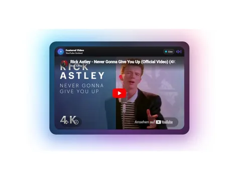
Ambient media player — a Framer component you configure entirely from property controls.

framer component
ArchivCMSArticleCard preview

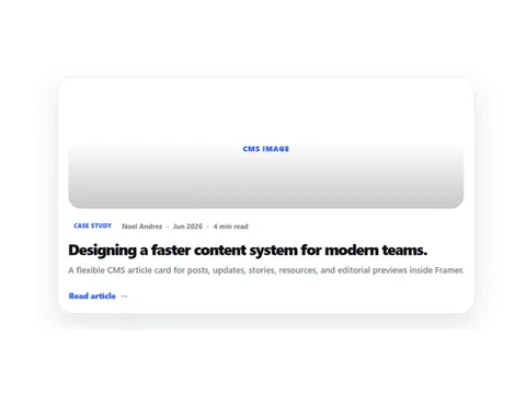
CMS Article Card — a Framer component you configure entirely from property controls.

framer component
Ascii Pulse Button preview

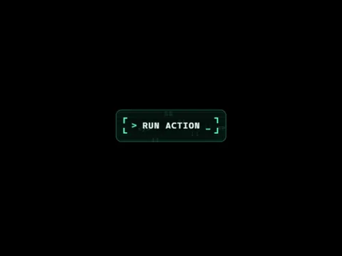
Retro terminal button — a Framer component you configure entirely from property controls.

framer component

Ready to launch

Start building today

Get instant access after checkout. Download the full source, customize locally, and deploy to your host.

View demo

Secure checkout via Lemon Squeezy

VisaMastercardPayPalApple PayGoogle Pay

Available payment methods may vary by device and region.

Frequently asked questions

Do I need code to customize Cartique?

No. Colors, typography, content, and behavior are exposed as Framer property controls in the right sidebar.

Does it respect reduced motion?

Yes. Motion is designed to degrade gracefully when visitors prefer reduced motion.