Why teams buy this component
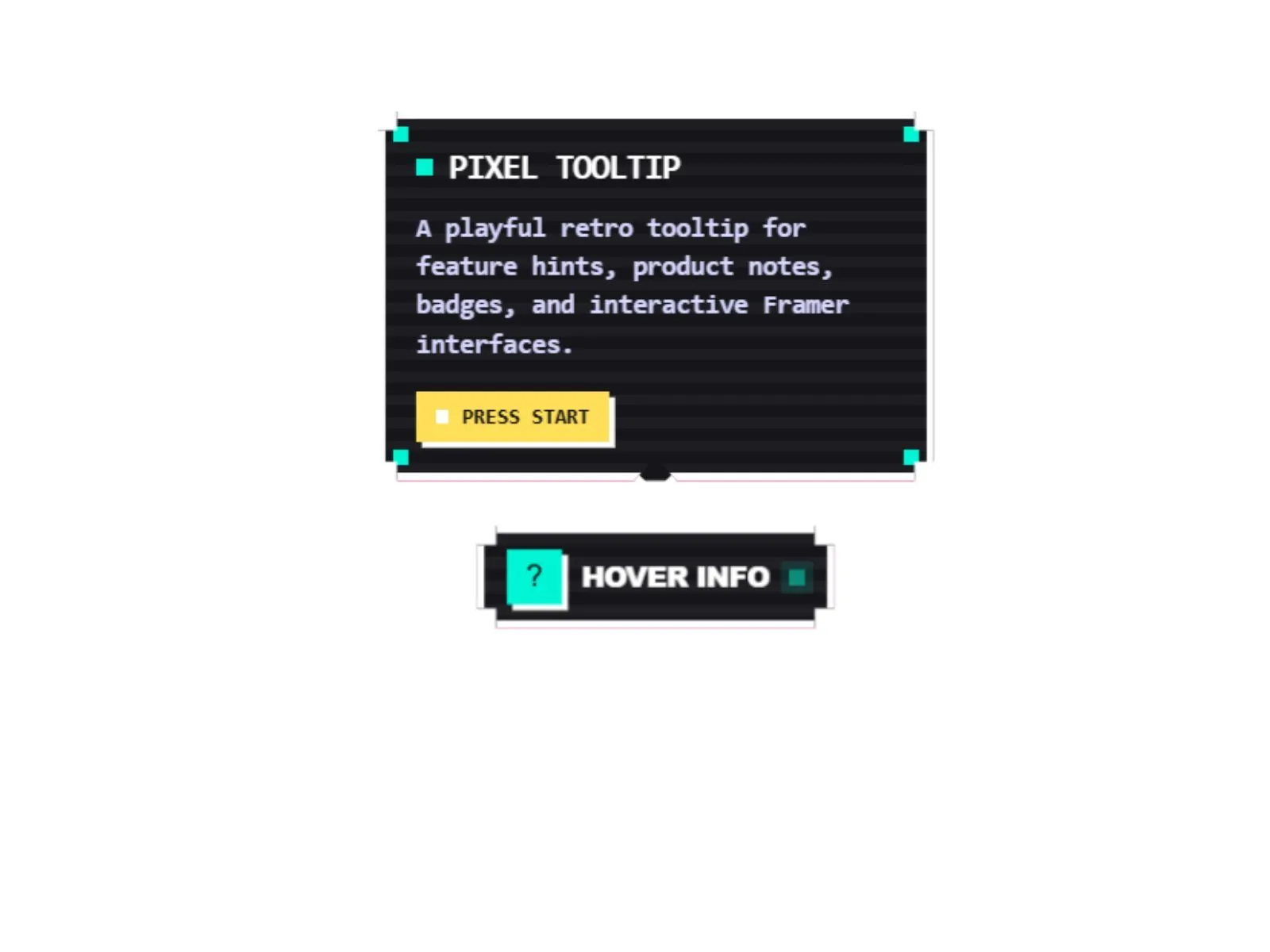
Pixora Pixel Tooltip is a playful premium Framer Code Component for creating retro game-inspired tooltips, info badges, feature hints, product notes, and interactive UI callouts.
It includes a pixel-style trigger, animated tooltip reveal, scanline texture, chunky pixel shadow, blinking status dot, helper label, corner pixels, multiple placements, retro visual variants, and full customization through Framer property controls.
Everything can be edited directly inside Framer. You can adjust the trigger text, icon, tooltip title, tooltip text, helper label, size, placement, colors, pixel size, corner style, scanlines, blinking dot, shadow, hover behavior, and disabled state without touching the code.
What you get
- Retro pixel-art tooltip style
- Hover and focus tooltip reveal
- Top, bottom, left, and right placements
- Pixel-style trigger button
- Scanline texture
- Chunky pixel shadow
- Blinking status dot
- Optional trigger icon
- Optional helper label
- Optional corner pixels
Configure in the sidebar
Every visual and behavioral option is a property control — drop the component on your canvas, open the right panel, and rebrand it to match your project in minutes.